In collaboration with the University of Toronto's Innovation Hub, our team set out to improve student access to campus recreational facilities.
At the time, booking a facility at U of T was a frustrating, disjointed experience—handled through a confusing website flow that left many students, including ourselves, feeling dejected. Each team member had personally struggled to navigate the system just to access basic services like the gym.
This led us to a core question: How might we simplify and streamline the experience for every student at U of T?

A Centralized App
Through user research, data analysis, and iterative prototyping, we identified that a mobile-first experience would be the most intuitive and comprehensive way to meet student needs. The app would centralize facility bookings, reduce friction, and eliminate the confusion of the existing system.
Our team—Keti Dzamova, Stefan Navarrete Lansall, Amy Chen Hui Ling Li, Miranda Yuan Meng, and myself—conducted the case study over six weeks. I led the user interviews, conducted usability testing, and designed key components of our prototypes.
Secondary Research
After deciding to focus on access to recreational resources, my team and I conducted several comprehensive studies, including:
- A competitive analysis
- Social media sentiment analysis
- A review of relevant scholarly articles
These secondary sources highlighted key issues around accessibility and usage of campus recreational facilities, helping us frame the problem space. They also informed the design of our primary research tools—many of our survey and interview questions were directly shaped by insights from this early research and remained central throughout the case study.
Primary Research
Building on our secondary research, my team and I developed a targeted set of questions aimed at uncovering the key pain points students faced when using the U of T recreational website. These questions were deployed in two main formats:
- A student survey
- Multiple semi-structured interviews
The survey, created using Google Forms, was distributed across relevant student channels including Reddit and Discord. Interviews were conducted via Zoom, with participants screened to ensure they were current U of T students and active users—or attempted users—of the recreational booking system.
- Interviewer:Walk me through the last time you booked a gym or recreational program at UofT.
- Did you find anything challenging about reserving a time slot?
- Do you have any positive experiences reserving a time slot?
- Do you have any negative experiences reserving a time slot?
- Do you use any tools to stay organized/keep track of your appointments? (e.g. google calendar, agenda etc.)
- How did booking a time slot make you feel?
Participant:.....
Overall Findings
We found several pain points which can be grouped into four themes:
1
Scheduling Difficulties
2
Communication and Information Finding
3
Physically Accessing and Finding Facilities
4
Personal Motivation
Each of these reflects issues of scheduling and the organization of information on the sport and recreation website
Persona and Empathy Map
From our user research, we developed a persona and empathy map: Neven the New Student—a non-binary, second-generation Asian-Canadian navigating university life for the first time.
Neven represented the key pain points we uncovered, especially among new students and marginalized groups. This persona guided every stage of our design process, ensuring our solution stayed inclusive, intentional, and user-centered.
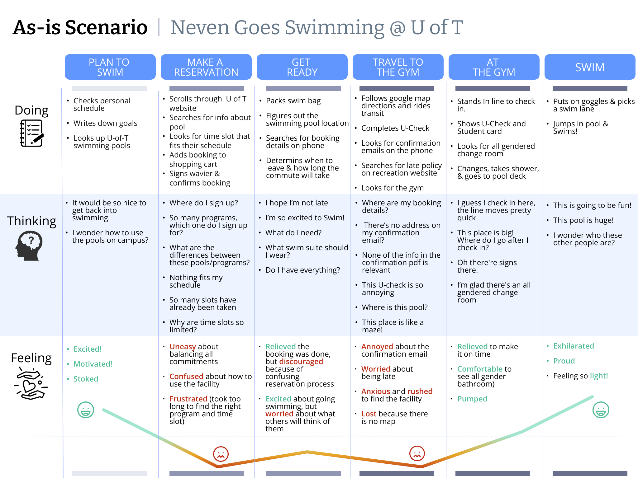
As-Is Scenario
To understand how users interacted with the current iteration of the U of T Recreation website, we created a Current User Journey or As-is Scenario highlighted below.
Each step took our persona through the typical way users interacted and booked on the current platform, highlighting the pitfalls and grievances, i.e pain points, conveyed in our user research.
Big Ideas
This process surfaced several “Home Run” ideas:
- Notifications for new availabilities
- Personalized fitness recommendations
- The ability to invite friends
All were integrated into a central All-In-One App concept.
Hill Statements
To align our team in our design process, we came up with three hill statements, a statement used to focus a product around the value that it delivers, to address our personas pain points. These were:
- Neven the New Student can discover preferred exercise activities in less than a minute
- Neven the New Student can keep an exercise streak while managing a full time course load
- Neven the New Student can feel comfortable using the gym with a growing circle of friends
These Hill statements situated and guided how we would overcome each pain point in our prototypes.
We then consolidated the strongest elements from each prototype into a single, cohesive design.
To validate our work, we conducted usability testing via Zoom. Participants were asked to complete tasks using the prototype while following a think-aloud protocol, allowing us to gather real-time insights into their experience and pain points.
Medium Fidelity Wireframe
Following participant feedback from our low fidelity prototype we constructed a medium fidelity wireframe. Adding and removing aspects of the app that participants had found to be frustrating or confusing.
The storyboard can be viewed here.
We optimised three flows and constructed our medium fidelity prototype on Figma. These three flows reflected the hill statements, with each focusing on a different pain point users experienced while navigating the current iteration of the U of T recreation website.


We then had a final usability test of our medium fidelity prototype. From participant feedback via a think aloud protocol, we consolidated our work. Doing three things in particular, which were:
- Removing favorites and organizing the booking menu
- Altering the favorites menu to be more readable
- Restructuring the alerts screen to be more accessible for finding waitlist and friends messages
These changes can be reflected below in blue, in contrast to the initial medium fidelity prototype above. Additionally, the final medium fidelity clickable prototype can be found here.
Evaluation
User testing and prototyping became two of my strongest areas, both of which played a central role in shaping the final product. Developing a clear framework for iterative design and research has equipped me with a versatile approach I’ll carry into future work.
